Add App Shortcuts to your Expo applications
Ever wondered how you can add custom shortcuts to your Expo applications? The expo-quick-actions library lets you add custom cross-platform shortcuts and handle them in your code.
I also made a video out of this blog post, you can check it out here.
How to add your own menu option with expo-quick actions
Assuming you already have an existing SDK 50 Expo project;
npx expo install expo-quick-actionsBecause this package includes native code, you’ll need to generate a new development build. If you’re using the default development profile set up by eas build:configure, you’re good to go. But if you’ve customized your build profiles, this step might look a little different for you. If you are unsure how to go about this, check my Setting up Maestro with Expo article for a step by step guide.
eas build –-profile development --platform ios # or androidAdding the quick action
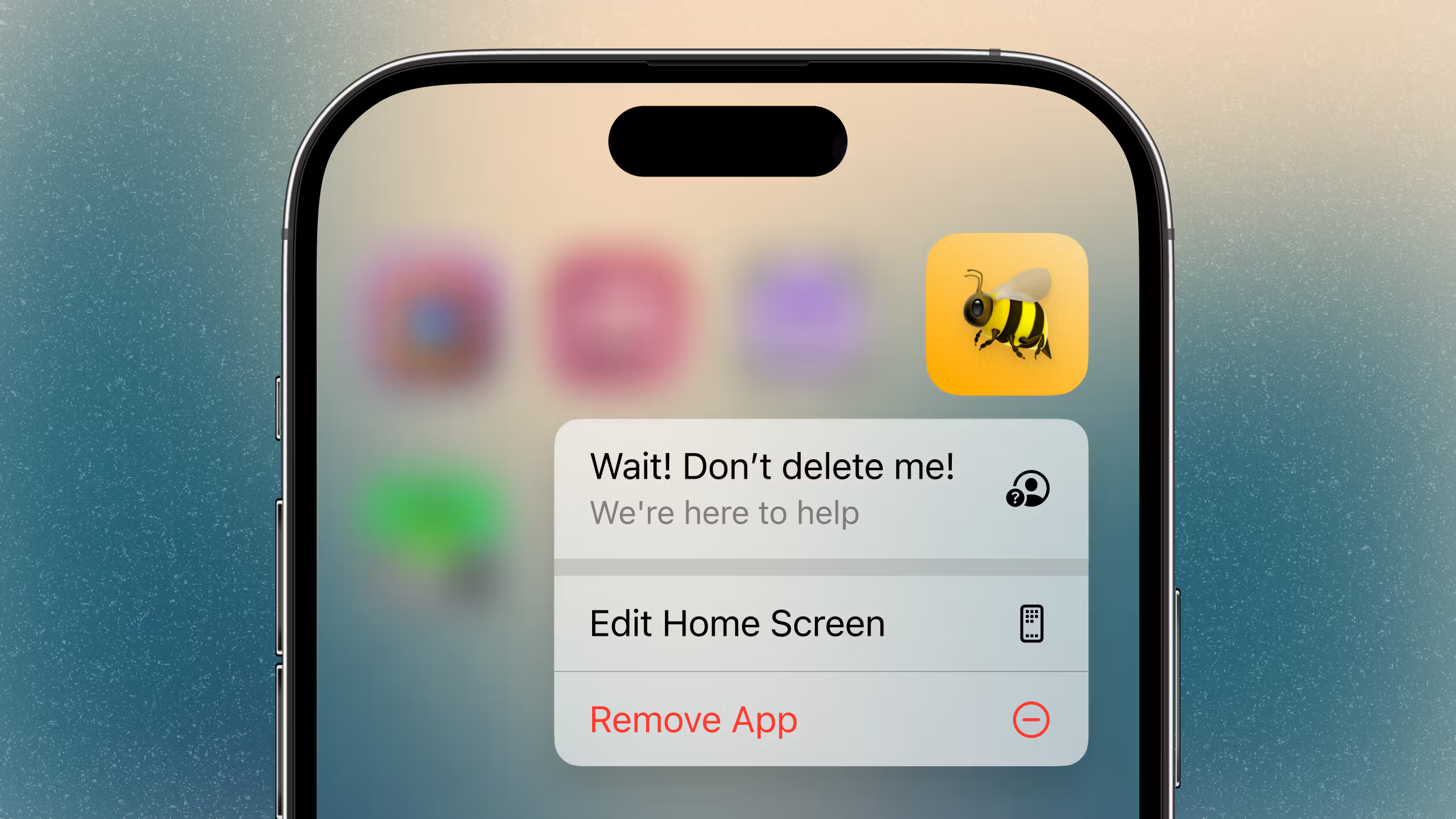
You’ll want to set up the quick action as soon as your app launches. In your root component (e.g., App.js or the top-level _layout.tsx file in an Expo Router project), call QuickActions.setItems.
import { useEffect } from "react";
import { Platform } from "react-native";
import * as QuickActions from "expo-quick-actions";

export default function App() {
  useEffect(() => {
    QuickActions.setItems([
      {
         "title": "Wait! Don't delete me!",
         "subtitle": "We're here to help",
         icon: Platform.OS === "ios" ? "symbol:person.crop.circle.badge.questionmark" : undefined,
         id: "0",
         params: { href: "/help" },
      },
    ]);
  }, []);
}
Run this code on your development build using npx expo start, then go back to your home screen and long-press your app’s icon. You should see the new menu option! These quick actions will remain available until your app updates them again—even if the app is closed.
Notice the use of Platform here. Apple recommends using their standard icon set for quick actions, particularly the SF Symbols library. You can install the SF Symbols desktop app to browse the full collection and find the name of a specific icon. expo-quick-actions will automatically use the correct SF Symbols icon for any icon string that starts with symbol:. Android doesn’t support SF Symbols; we’ll cover what to do for Android in a moment.
Reacting to quick action
When you tap your quick action, it’ll open your app—but that’s it. You’ll need to listen for the callback that fires when the quick action is selected. Add the listener hook in your root component, or somewhere else high enough in the component tree that it’s always mounted:
import {
  useQuickActionCallback,
} from "expo-quick-actions/hooks";

export default function App() {
  useQuickActionCallback(action => {
    // … do something
  });
}
The action object contains the params you included when calling setItem. From the perspective of the native API, those parameters are arbitrary—it’s up to you to decide what to do with them. For example, you might use them to navigate to another screen. It could be as simple as opening your support email by calling:
Linking.openURL(“mailto:[email protected]?subject=My App Support Request”);However, it can feel a bit jarring to open an email directly like that. So instead, let’s go back to the idea of adding a friendly “Help” landing page—one that can offer advice on common issues and solutions, along with a link to contact support if needed.
Expo Router, quick actions
expo-quick-actions works perfectly well with React Navigation; you’ll just need to call navigate yourself inside useQuickActionCallback if you want to send the user to another screen. However, the package includes some built-in auto-routing features for Expo Router projects.
Let’s update the initial setItems call in our root _layout component
export default function Layout() {
  useEffect(() => {
    QuickActions.setItems<RouterAction>([
      {
        "title": "Wait! Don't delete me!",
        "subtitle": "We're here to help",
        icon: /* … */,
        id: "0",
        params: { href: "/help" },
      },
    ]);
  }, []);

 // …
}
Then, also in your root component or in another high-level layout file, add:
import { useQuickActionRouting } from "expo-quick-actions/router";

// …

// inside layout component
useQuickActionRouting();
The href in the params has special significance when using Expo Router. If the href matches a valid route in your app (for example, if href is /help and you have a help.tsx route in your root), then tapping that quick action will automatically navigate the user to the Help page. That’s where you can provide your support resources, including a link to contact your team. Expo Router’s Link component can help with that:
import { Link } from "expo-router";

// … inside your help page
<Link href="mailto:[email protected]?subject=Help!" asChild>
  <View style={Styles.button}>
     <Text>Email Us</Text>
  </View>
</Link>
Config plugins
Everything we’ve done so far runs when your app is launched, using the native APIs wrapped by expo-quick-actions. Now it’s time to bring in the expo-quick-actions config plugin to help with build-time setup.
Remember that missing Android icon? The config plugin will make sure it’s included in your app so it’s available at runtime. According to Android documentation, shortcut icons should use adaptive icons, since these can even be dragged out of the menu and placed directly on the home screen as their own shortcuts. It’s unlikely someone will do this with your “Help” action—but hey, you never know.
Adaptive icons are made up of a solid-color foreground (like a logo outline or simple icon) layered over a transparent background. You then specify a background color, which the Android launcher uses behind the icon when it’s displayed. For more guidance on creating these, check out Expo team’s video tutorial on making icons and splash screens. The video description even includes a helpful Figma template for building adaptive icons.
Once you have your icon ready, set up the config plugin in your app config (app.json or app.config.js):
"plugins": [
  [
     "expo-quick-actions",
     {
       "androidIcons": {
          "help_icon": {
            "foregroundImage": "./assets/images/adaptive-icon-help.png",
            "backgroundColor": "#29cfc1"
          }
        }
      }
   ]
]
Now you can add that Android icon when calling setItems:
QuickActions.setItems([
  {
     title: "Wait! Don't delete me!",
     subtitle: "We're here to help",
     icon: Platform.OS === "ios" ? "symbol:person.crop.circle.badge.questionmark" : "help_icon",
     id: "0",
     params: { href: "/help" },
   },
]);
If you want to use a custom icon on iOS, you can also set this in the expo-quick-actions plugin configuration object:
"iosIcons": {
  "custom_help_icon": "./assets/images/custom_help_icon.png",
}
Finally, iOS includes the ability to set a static quick action. This quick action will show up even before your app is run for the first time. Add this to the expo-quick-actions plugin configuration object:
"iosActions": [
  {
    "title": "Wait! Don't delete me!",
    "subtitle": "We're here to help",
    "icon": "symbol:person.crop.circle.badge.questionmark",
    "id": "0",
    "params": { "href": "/help" },
  }
]
Any dynamic quick actions you define in your JS code will be appended after the static actions, so, if you do this, make sure setItems is only run on Android.