Web Accesibility Fundamentals
Learn fundamental concepts about making web applications accessible to all users. We will cover screen readers, semantic HTML, and ARIA roles.
Our focus today will be screen readers. When building websites with accessibility in mind, you want the screen reader to be able to pick up your elements and the HTML tree. So what is a screen reader?
According to Wikipedia, a screen reader is:
A screen reader is a form of assistive technology that renders text and image content as speech or braille output. Screen readers are essential to people who are blind, and are useful to people who are visually impaired, illiterate, or have a learning disability.
So we need to do some tweaking to our HTML elements so that the screen reader can pick our elements without a problem.
Semantic HTML
When we started learning, we all heard about how it is important to use semantic HTML tags. Besides the obvious reason that semantic HTML tags are easier to read and understand — for example, by web developers reviewing the code — there are two more specific reasons why you should always use semantic tags. Which are accessibility and SEO. Semantic tags are important because the readers can understand your content better because their screen readers will communicate your content more accurately. If you want to dive deeper into semantic tags, check out this resource.
Comparison of HTML tree with a bunch of divs and with semantic HTML tags
So instead of using div or section for tags, we should choose more specific tags that align with our
content. For example: If we have a sidebar, this sidebar should be inside the <aside> tag. Or if
we
have a navigation, it should be wrapped with <nav> tag and so on. This helps screen readers scan
through our content more easily. Imagine if we just had a bunch of divs that screen readers tried to
read to our visually impaired end user, they would have no chance to know in which section they are
or what the current content means.
What if there is no existing element for what we are trying to build ?
WAI-ARIA
WAI-ARIA (Web Accessibility Initiative — Accessible Rich Internet Applications) is a specification written by the W3C, defining a set of additional HTML attributes that can be applied to elements to provide additional semantics and improve accessibility wherever it is lacking.
Let’s say that we have a carousel in our website for showing images, HTML has no semantic tags for a carousel, so this is where ARIA comes in.
ARIA has three main features which are; Roles, Properties and States. In this article we will cover Roles, but I highly suggest checking out this MDN documentation to learn more.
Roles
These define what an element is or does. Many of these are so-called landmark roles, which largely duplicate the semantic value of structural elements, such as
role=”navigation”(nav)orrole=”complementary”(<aside>). Some other roles describe different page structures, such asrole=”banner”,role=”search”,role=”tablist”, androle=”tabpanel”, which are commonly found in UIs.
Note: ARIA only changes the semantics, it just changes what a screen reader will announce to a reader. It does NOT add any features, like navigating it with a keyboard, etc. You would still need to do that additional work to add that.
Let’s say that we want to have a custom checkbox (you should always try to use the
semantic <checkbox> element) which would look like this.
<div id="myCheckbox" class="checkbox"></div>For visual users, this would be just a normal checkbox considering we styled it properly. But here is the thing, the screen reader will just read this as “group”, because the div tag is mostly used to group elements. So this is where ARIA comes in.
<div
	id="myCheckbox"
	class="checkbox"
	role="checkbox"
	aria-checked="false"
></div>
In this code, we added aria-checked="false" and role="checkbox". Now the screen reader will read
something like this; “unchecked, checkbox”. This is still not good enough but we’ve paved the way
for further improvements. The user still doesn’t know what this checkbox is for. If we used semantic
tags like input or checkbox we could have used <label> but this won’t work on our checkbox.
<div
	id="myCheckbox"
	class="checkbox"
	role="checkbox"
	aria-checked="false"
	aria-label="Agree to our terms"
></div>
The aria-label attribute labels our element for screen readers. So this would read: “Agree to our
terms, unchecked, checkbox”. This looks good for a starting point.
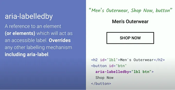
There is also an attribute called aria-labelledby which is used to label an element by another element.

There is a lot to cover, even for a fundamental introduction but I will leave some resources to where to go from here, and in the next article, we will go deep with how to use accessibility in frontend frameworks like React and some tools to help us stay in track and also help us find accessibility issues.
For visual learners this video is a good starting point: https://www.youtube.com/watch?v=z8xUCzToff8
MDN also has some tutorials about accessibility: https://developer.mozilla.org/en-US/docs/Web/Accessibility